Web Design & Development
How to Make Framer CMS Rich Text Images Responsive (Free Code)
Framer CMS images can look too small—or become enormous after a basic width fix. Here is the free responsive image solution I built for Rich Text articles.
By Worth the cart
•
•
3 min read


If you publish articles through Framer CMS, you may have encountered a surprisingly frustrating problem: images inside your Rich Text content do not always match the width of the article.
That was exactly what happened on WorthTheCart.
Some images appeared much smaller than the text around them. They looked like thumbnails dropped into the middle of a full-size article, even when the original files were large and high quality.
The obvious fix seemed simple: force every image to use 100% of the available width.
It worked—at first.
Wide screenshots and landscape photos finally filled the article properly. But then square product images and tall portrait photos became enormous. A portrait image could take over the entire screen and force the reader to scroll just to get past it.
The first fix solved one problem by creating another.
What I actually needed was a responsive Framer CMS image solution that could tell the difference between a wide image, a square image, and a tall image. Each format needed its own sizing rules.
That led me to build Framer CMS Responsive Article Images, a lightweight CSS and JavaScript snippet that is now available for free on GitHub:
https://github.com/worththecart/framer-cms-responsive-images#framer-cms-responsive-article-images
Suggested image: Add a before-and-after comparison from one of your WorthTheCart articles. Show the same landscape image appearing too small on the left and correctly filling the article on the right. Add “Before” and “After” labels.
Why Framer CMS Images Can Be Difficult to Size
Framer gives you useful sizing controls for regular image layers. You can set an image to fill its container, choose a fixed width, change its aspect ratio, or adjust how it behaves across different breakpoints.
Images inside a CMS Rich Text field are different.
The image is part of the article content rather than a separate layer you can select and adjust on the canvas. A single article may also contain several different image formats:
Wide screenshots
Product comparison graphics
Square product photos
Vertical Pinterest-style images
Portrait photography
Charts and infographics
Applying one fixed width to all of them rarely produces a good result.
A question in the Framer Community captures the frustration well:
“Can’t ‘fit to content’ for an image?”
That question appeared in a Framer Community support discussion.
Regular Framer image components and CMS Rich Text images are not exactly the same problem, but the underlying frustration is familiar: an image should adapt naturally to its content and container without requiring awkward manual sizing.
For CMS articles, the ideal behavior depends on the shape of each image.
Why Width: 100% Is Not the Complete Answer
The most common CSS solution is to give every image a width of 100% and an automatic height.
This can be useful for wide images. It makes them responsive and prevents them from extending beyond the article container.
However, it treats every image in exactly the same way.
Imagine an article container that is 900 pixels wide.
A wide 1600 × 900 screenshot will normally look good when displayed at the full 900-pixel article width. A square 800 × 800 product image may already be large enough. A tall 800 × 1400 portrait image can become overwhelming if it is stretched across that same width.
The browser needs more information before it can choose the right presentation.
The Solution: Size Each Image According to Its Shape
The code I created checks the original width and height of every image inside a Framer Rich Text container.
It divides the width by the height to calculate the image’s aspect ratio, then adds one of three classes:
article-image-landscapearticle-image-squarearticle-image-portrait
Each class receives different sizing rules.
Portrait images with an aspect ratio below 0.85 use their natural width, with a maximum width of 680 pixels and a maximum height of 82% of the screen.
Square or nearly square images with an aspect ratio between 0.85 and 1.2 can use the available width but stop at a maximum width of 800 pixels.
Landscape images with an aspect ratio of 1.2 or higher are allowed to fill the full article width.
On mobile screens measuring 600 pixels or less, every image remains within the available screen width.
This means wide article graphics can finally use the space available to them, while portrait and square images remain comfortably readable.
As the project description explains:
“It automatically makes images inside Framer CMS Rich Text articles responsive without making portrait or square images look gigantic.”
Suggested image: Add a three-column graphic showing a landscape image, square image, and portrait image. Under each image, include its class name and maximum sizing behavior.
What the Framer CMS Image Fix Does
The snippet is intentionally lightweight, but it handles more than a basic CSS rule.
It Detects the Original Image Dimensions
JavaScript reads the natural width and natural height of each image. These values represent the image’s original pixel dimensions.
This allows the code to classify the image based on its real shape instead of guessing from how it currently appears on the page.
It Preserves the Original Aspect Ratio
Every image uses an automatic height and object-fit: contain, reducing the risk of stretched or distorted content.
It Controls Oversized Portrait and Square Images
Portrait images are limited to a maximum width of 680 pixels.
Square and nearly square images can use the available width but stop at 800 pixels. Both image types are also limited to 82% of the viewport height on larger screens.
This prevents a single product photo or vertical graphic from taking over the entire page.
It Lets Landscape Images Fill the Article
Wide images can use 100% of the Framer Rich Text container.
This is especially useful for:
Product comparisons
Screenshots
Banners
Charts
Graphics containing text
Wide lifestyle photography
These images often become difficult to read when Framer displays them at a small fixed width.
It Supports Mobile Screens
At screen widths of 600 pixels or less, all images remain within the available screen width.
Readers should not need to scroll horizontally or pinch the page just to see the complete image.
It Handles Dynamically Loaded CMS Content
Framer can load or replace page content through client-side navigation.
The code uses a MutationObserver to watch for changes and classify images that appear after the initial page render.
This is important when the code is set to run on every page visit.
It Only Targets Rich Text Images
The code specifically targets images inside Framer Rich Text containers.
This means it should not change:
Your website logo
Navigation icons
Product cards
Hero images
Footer graphics
Images elsewhere on your website
The styling remains focused on images embedded inside CMS Rich Text content.
How to Add the Code to Framer
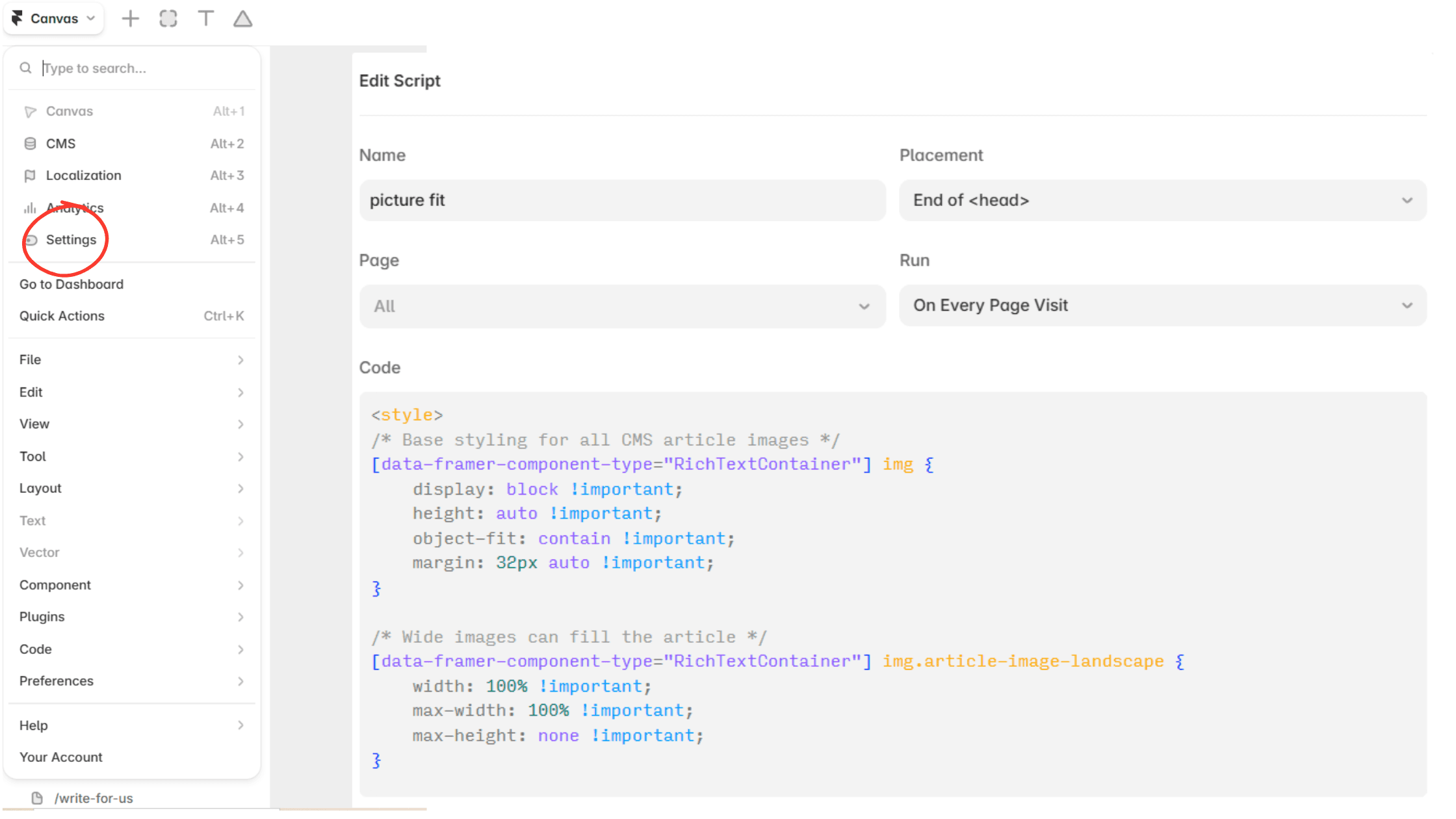
You do not need to install a package or connect an external service.
Open the free Framer CMS Responsive Article Images repository:
https://github.com/worththecart/framer-cms-responsive-images
Open the file named
framer-cms-responsive-images.html.Copy the complete code.
Open your Framer project.
Go to Site Settings and open Code or Custom Code.
Add a new code snippet and paste the complete code.
Set Placement to End of
<head>.Select Run on Every Page Visit.
Save your changes and publish the website.
The script waits until the page content is ready before starting its image observer, so it is designed to work from the end of the <head> section.
If you already have custom code, add this as a separate snippet when possible.
You can also place it below your existing code, but you should not delete unrelated scripts that your website already uses.
Suggested image: Add a screenshot of the Framer Custom Code settings here. Show the pasted code with “End of <head>” selected and “Run on Every Page Visit” enabled. Blur any private project information before publishing the screenshot.
How to Customize the Image Sizes
The default settings are designed to work well for normal blog and editorial layouts, but every website is different.
If your article column is narrow, you may want square images to stop at 650 or 700 pixels instead of 800 pixels.
If your website uses large editorial photography, you may want portrait images to reach 720 pixels.
The main value for square images is:
The main value for portrait images is:
You can also change the 82vh value.
The vh unit is based on the height of the reader’s screen. A maximum height of 82vh means the image can use up to 82% of the viewport height.
If your website contains many vertical infographics that need to be viewed at a larger size, you could increase this value.
If you want readers to see more text above and below each photo, reduce it.
Important Things to Know Before Using It
This is a practical custom-code solution, not an official Framer feature.
Test it on your published website after installation, especially if your Rich Text component already has custom styles.
The snippet uses !important declarations because Framer’s generated styling can otherwise override the image rules.
The code also depends on Framer’s current RichTextContainer attribute. If Framer changes its generated page structure in the future, the selector may need to be updated.
Keeping the code publicly available on GitHub makes it easier to publish improvements and let users download the newest version.
The snippet is best suited for images embedded inside CMS Rich Text. It is not intended to replace the sizing controls for normal image components that you can select directly on the Framer canvas.
Why I Released It for Free
This started as a small fix for my own articles on WorthTheCart.
Once it worked, it felt more useful as a public resource than as a private piece of code hidden inside one website.
Framer creators, bloggers, affiliate publishers, and small website owners often experience the same visual problems. Not everyone wants to write custom JavaScript just to make an article image look normal.
The repository uses the MIT License, so anyone can use it, modify it, and adapt it to their own project.
You can also download the entire project by opening the GitHub repository and selecting:
Code → Download ZIP
Suggested image: Add a clean screenshot of the GitHub repository here. Highlight the green “Code” button and the framer-cms-responsive-images.html file. Place this image near the final call to action.
Final Thoughts
Good article design is often about fixing small details that interrupt the reading experience.
An image that is too small can make an article look unfinished. An image that fills the entire screen can feel equally distracting.
The best result is not to make every image bigger. It is to give each image enough space for its shape and purpose.
That is what this code is designed to do.
If your Framer CMS Rich Text images look too small, too large, or inconsistent across devices, you can download the free solution, follow the installation steps, and adjust the maximum sizes to fit your own layout.
Get Framer CMS Responsive Article Images free on GitHub:
https://github.com/worththecart/framer-cms-responsive-images#framer-cms-responsive-article-images
Keep reading


